
Blog
How Three Creators Visualize the World’s Languages
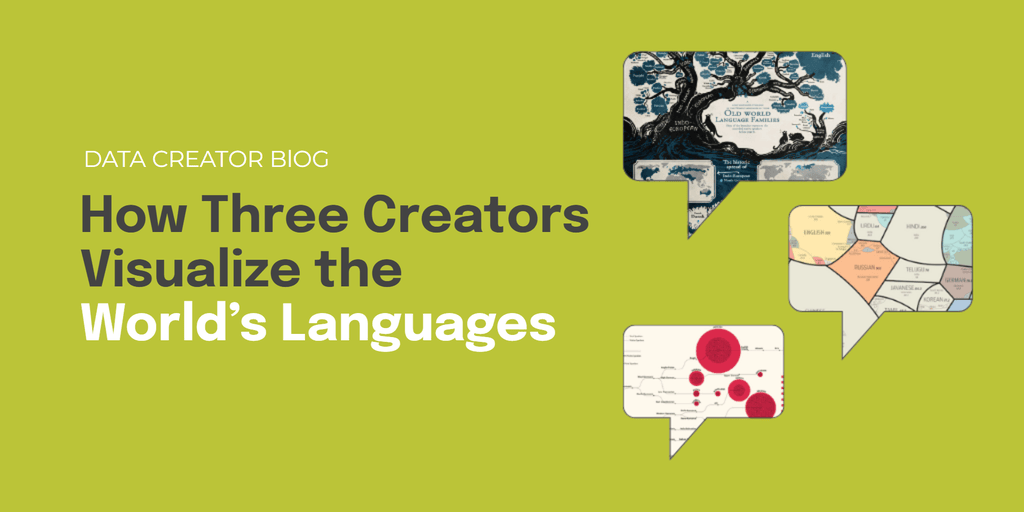
Thousands of living languages exist today, overlapping across geography, ancestry, and identity. Turning that complexity into something people can see and understand is no easy task. Designers and researchers have taken on this challenge in different ways: some focusing on structure and scale, others on heritage and evolution. Each offers a glimpse into how data…
Continue Reading How Three Creators Visualize the World’s Languages
When the World Turned to Data: Lessons from COVID Visualizations
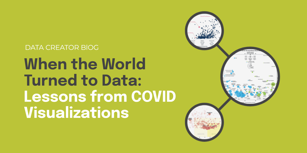
When COVID-19 spread globally, data became a shared language. Charts, dashboards, and scatterplots were no longer niche—they were how billions made sense of a rapidly changing world. From infection curves to risk maps, visualizations became the defining storytelling tool of the era. Some clarified uncertainty, while others added confusion. Here, we look back to reveal…
Continue Reading When the World Turned to Data: Lessons from COVID Visualizations
Evolving Your Data Storytelling: Pushing Past the Obvious
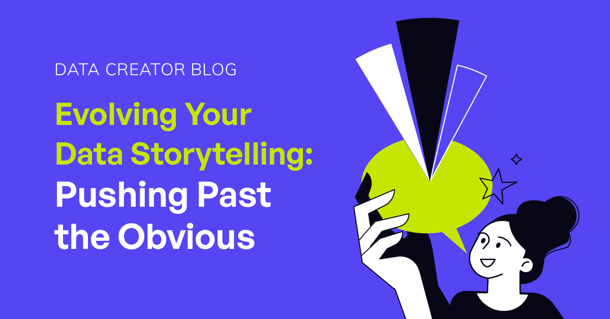
When data visualization and accessible insights were still relatively new to mainstream audiences, simple revelations could captivate viewers. “Finland is the happiest country” or basic economic comparisons felt genuinely surprising. There was abundant low-hanging fruit in both topics and visual storytelling approaches. But success in the creator economy creates its own challenges. As creators have…
Continue Reading Evolving Your Data Storytelling: Pushing Past the Obvious
3 Simple Ways to Make Your Data Visualizations Clearer
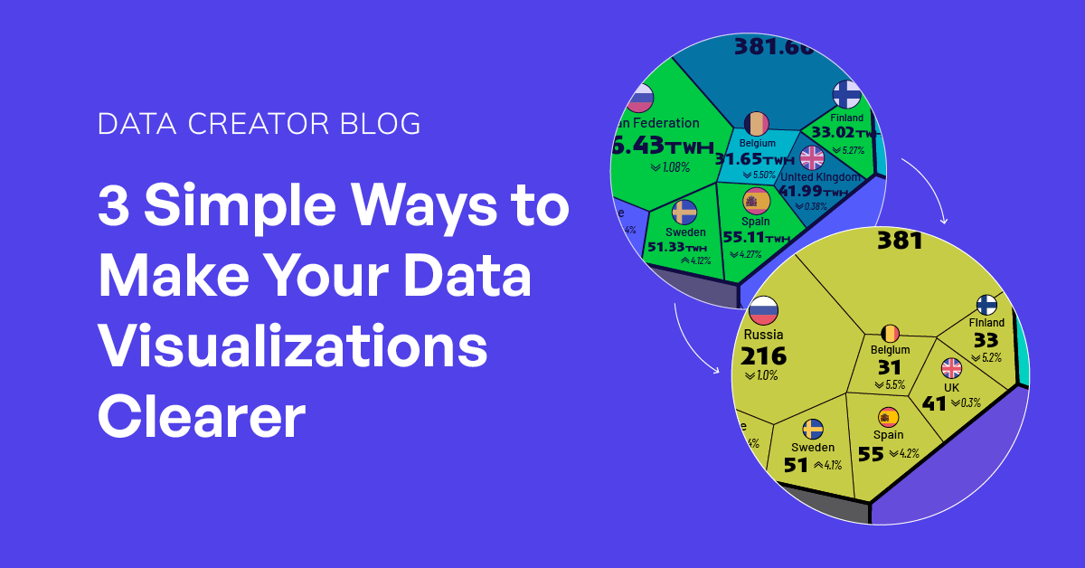
In the fast-paced world of online content, data visualizations have to work hard. They need to be clear, concise, and immediately understandable—especially for audiences scrolling on mobile. Small design missteps can easily distract from the story you’re trying to tell. Here are three simple but powerful tips to help your charts and graphics cut through…
Continue Reading 3 Simple Ways to Make Your Data Visualizations Clearer
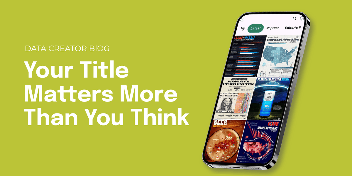
Your Title Matters More Than You Think
In the world of data storytelling, a good visual catches your eye. A great caption keeps you there. That single line of text on your graphic—what we’ll call the graphic title—can make or break how people engage with your content. It sets the tone, teases insight, and invites curiosity. Here are a few examples of…
4 Visuals That Grabbed Attention Instantly (And Why)
Some visuals demand your attention before you even read the caption. A bold number, a clever design twist, or a timely insight can be all it takes to stop someone mid-scroll. In this edition of our Data Creator blog, we’re spotlighting four recent Voronoi posts that did just that—and what you can borrow for your…
Continue Reading 4 Visuals That Grabbed Attention Instantly (And Why)