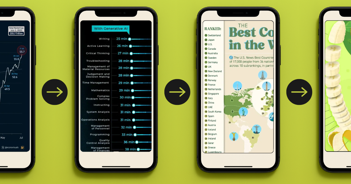
4 Visuals That Grabbed Attention Instantly (And Why)

Some visuals demand your attention before you even read the caption.
A bold number, a clever design twist, or a timely insight can be all it takes to stop someone mid-scroll.
In this edition of our Data Creator blog, we’re spotlighting four recent Voronoi posts that did just that—and what you can borrow for your next visual.
#1 S&P 500 Market Cap Hits Record $55.7 Trillion by @Soltani 📈
A simple chart and the right timing turned this post into a much bigger story.
Why it works:
- Timely: Posted just days after the record was hit, it taps into a current milestone while it’s still fresh in people’s minds.
- Bold Headline: $55.7 trillion is a massive figure—and leading with it grabs attention instantly.
- Clear Narrative: Despite early-year volatility, the chart shows a strong recovery at a glance.
- Bigger Context: With the economy, geopolitics, and trade tensions dominating headlines, this chart taps into real-world uncertainty—but also resilience.
- Clean Design: The trend is the focus with this single line chart, free of distractions.
#2 Productivity Gains from Using AI by @visualcapitalist 🤖
AI is one of today’s most relevant topics, with this chart showing the real numbers behind the hype.
Why it works:
- Timely and Credible: AI is dominating headlines, and this chart backs it up with research from Stanford and the World Bank.
- Actionable: It doesn’t just show that AI is faster—it shows how much faster across a wide range of real work tasks.
- Easy to Read: A side-by-side bar chart makes comparison effortless, even on mobile.
- Unexpected Insights: Some of the biggest productivity gains are in areas people don’t always associate with AI—like troubleshooting, critical thinking, and judgment.
- Impactful Scale: When you see tasks cut from 120+ minutes down to 30 or less, the impact is hard to ignore.
#3 The 40 Best Countries in the World, As Determined by the People by @visualcapitalist 😏
Everyone wants to see how their country ranks, and this chart taps right into that timeless curiosity.
Why it works:
- Perception-Based: The ranking reflects how people around the world feel about these countries, based on 73 attributes from quality of life to cultural influence.
- Instant Comparison: Viewers instinctively scan for their own country and size it up against others—especially near neighbors or rivals.
- Surprise Twist: Switzerland at #1 shakes up what people might expect.
- Simple and Shareable: A clean, emoji-enhanced list makes it highly scrollable and easy to share.
#4 Banana Production by Country (2023) by @louislugas
A playful shape can make everyday data hard to scroll past.
Why it works:
- Fun Format: The peeled banana shape is bright, thematic, and highly scroll-stopping.
- Snackable Depth: This chart shows the top 10, but the full ranking goes way deeper.
- Adds Context: A quick caption adds value by briefly connecting banana production to global food security and economic resilience.
- Simple and Relevant: With a topical crop and easy-to-read layout, this post makes global agriculture feel accessible and timely.
Bring Your Next Visual to Life
The best visuals don’t just show data—they spark curiosity.
If you’ve got an insight buried in a spreadsheet somewhere, find the story and bring it to life for your next visual.