
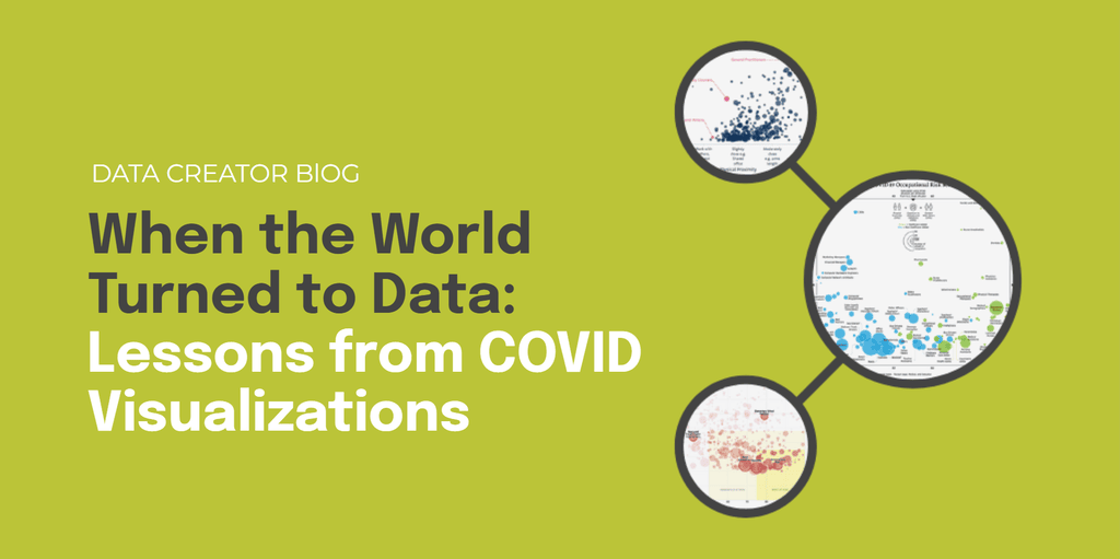
When the World Turned to Data: Lessons from COVID Visualizations
When COVID-19 spread globally, data became a shared language.
Charts, dashboards, and scatterplots were no longer niche—they were how billions made sense of a rapidly changing world.
From infection curves to risk maps, visualizations became the defining storytelling tool of the era. Some clarified uncertainty, while others added confusion.
Here, we look back to reveal powerful lessons for today’s creators on how to make data human, clear, and trustworthy in moments that matter.
The Dataset Behind the Story
As workplaces shut down, one question echoed across industries: “How risky is my job?”
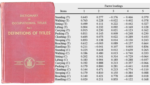
To answer it, journalists and researchers turned to O*NET—the U.S. Department of Labor’s comprehensive database of occupations. It quantifies hundreds of roles based on attributes like physical proximity, contact with others, and exposure to disease.
By pairing those attributes with income data, storytellers could reveal which jobs carried the greatest health and economic risks. What followed were some of the most widely shared visualizations of the pandemic, each taking a different approach to clarity and empathy.
#1 The New York Times
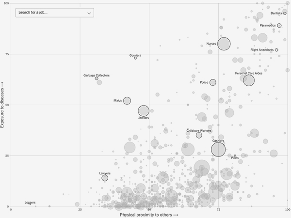
This interactive scatterplot by The New York Times mapped proximity and exposure for hundreds of jobs, with bubble size showing occupation size.
Why it worked:
- Guided scrolling highlighted key professions and built narrative flow.
- Minimal labels kept it clean and explanatory.
- Hover details added income context, connecting health risk to economic impact.
In short, this visualization is a masterclass in balancing depth with simplicity, and letting the data tell the story.
#2 Politico
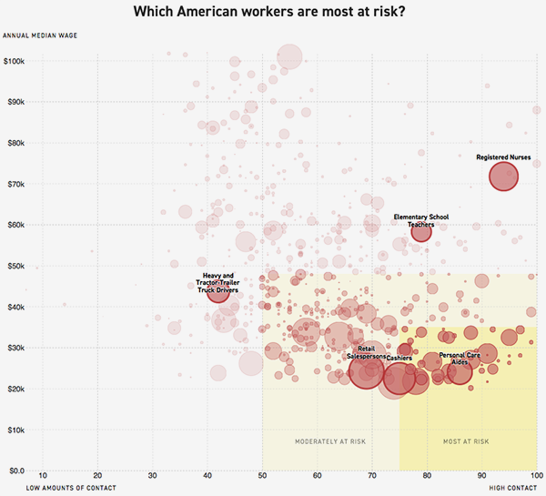
Politico visualized proximity vs. income, linking physical exposure and financial insecurity.
Why it worked:
- Color consistency unified text and chart.
- Highlights directed focus to the most vulnerable groups.
- Restraint in labeling emphasized broader patterns.
By pairing risk with income, the visualization turned statistics into empathy–showing not just who was vulnerable, but why.
#3 Brookfield Institute
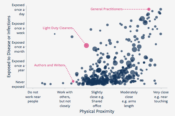
The Brookfield Institute for Innovation + Entrepreneurship in Canada visualized proximity and frequency of exposure to disease.
Why it worked:
- Grouping similar occupations made the scroll experience narrative.
- Plain-language labeling kept it accessible to all readers.
- Highlighting select jobs gave viewers familiar reference points.
This visualization is a reminder that language clarity and visual hierarchy are as vital as the data itself.
#4 Visual Capitalist
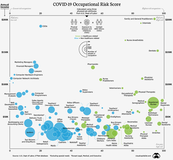
The Visual Capitalist version used static scatterplots, combining proximity, contact, and exposure against income to map four quadrants of occupational risk:
- High pay / low risk
- High pay / high risk
- Low pay / low risk
- Low pay / high risk
Color coding distinguished healthcare roles, underscoring their heightened danger. Even without interactivity, the clean structure and visual contrast made it instantly understandable and highly shareable.
Lessons for Today’s Creators
These visualizations did more than show risk—they built understanding. In a time of confusion, they gave people a way to locate themselves in the data and see meaning in the numbers.
That’s the timeless principle of great data storytelling: clarity, empathy, and trust. Your next visualization could do the same.