
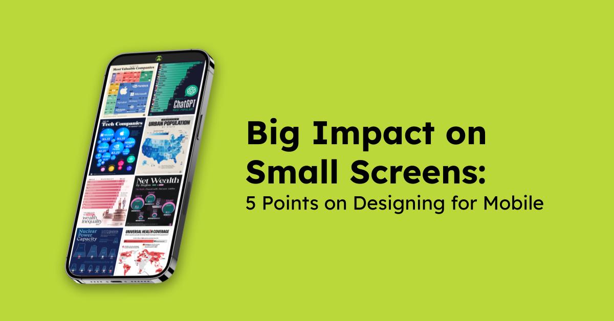
Big Impact on Small Screens: 5 Points on Designing for Mobile
More and more people are discovering data on their phones—and that’s precisely why we created Voronoi.
But as we discussed in the last blog post, stopping the scroll with a visual isn’t always easy.
The good news? One crucial factor is within your control: designing for mobile.
Making sure your visual is mobile-friendly and clearly designed goes a long way to engaging with users. Here are 5 points to keep in mind for your next visual.
1. Make Text Easy to Read
Use large, high-contrast text for headlines, labels, and annotations.
You might be tempted to use a small font size to have a ‘cleaner’ design, however if a user keeps scrolling past your visual because they didn’t want to zoom in to read your text then was it worth it?

2. Let the Data do the Talking
Don’t make people work to figure out the point.
If you use the right chart to tell your story then a quick glance is all that’s needed for viewers to get it—and remember it.
When every second counts on mobile, clear almost always beats clever.

3. Design the First Impression
Don’t bury your most interesting insight—make it the visual focal point.
A bold number, striking shape, or smart use of contrast can instantly catch the eye. You can even use visual hooks or text callouts to directly highlight key takeaways.
4. Less is More
Dense dashboards and complex charts may look impressive on desktop but rarely translate well to small screens.
Instead, focus on one clear message or story per visual.

5. Simplify—or Split it Out
We get it—sometimes you discover such rich datasets in your research, it can be tempting to visualize it all. But instead of cramming it all into one image, consider breaking it up.
You could use a slideshow to show related data across multiple visuals, like this post showing Europe’s National Minimum Wages in 2025, both with and without living cost adjustments.
Or, if your content has multiple strong takeaways, each one might deserve its own post altogether. The dataset behind ‘The Most Popular American Baby Names’ was too good not to split into two posts—one for boys and one for girls.
No matter the dataset(s) you’re working with, make sure you give your message—and your audience—room to breathe.
Ready to Post Your Next Visual? Start with Mobile in Mind.
Still not sure if your visual works on mobile? Just test it. Open it on your phone and ask yourself (or a friend!):
- Is the data clear?
- Does the design draw the eye to the right place?
- Can I read the text without excessive zooming?
Whether it’s your first post or your fiftieth, designing for mobile makes your work easier to see, understand, and share.
We can’t wait to see what you create next!