
Learning From Top Posts on Voronoi
Why do people like what they like?
It’s an age-old question that even the most experienced designers and storytellers grapple with as they publish their work. The world is a patchwork of aesthetic preferences, and sometimes contradictory visual language. Simply put, there’s no easy answer. As with most endeavours, the most successful practitioners are great at pattern recognition. They experiment a bunch, see how people react, and adjust their approach accordingly.
In the modern world, the real heavy lifting of pattern recognition is now done by algorithms. The great voting machines on each platform are each their own Darwinistic systems, choosing specific content and elevating it above all others based on the reactions of millions of people. Voronoi is not the size of Meta, but our voting machine–powered by you!–still elevates some data stories to the top.
Here are the eight top performing posts of all time on Voronoi:
What can we learn from these top data stories? Are there universal attributes or potent design tricks that creators can use in their own work? We’ve identified a few key commonalities. Let’s dive in.
Attributes of Top Data Stories
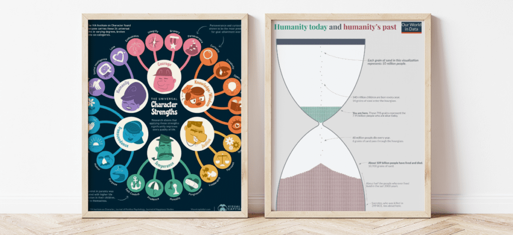
1. Universality
In order to become one of the most popular graphics, the topic needs to have broad appeal. The topics in the examples above–personality traits and death–apply to every human being on Earth. Of course, these graphics are supported by strong visual concepts.
The iconic hourglass design created by Our World in Data was actually inspired by a previous design by Oliver Uberti, an author and former senior design editor for National Geographic. Now, it’s a bold move to recreate a design from somebody who’s so accomplished in their field, but OWiD put their own spin on the concept that added value and exposed a wider audience to this fascinating dataset. There are two keys to remixing an existing design, 1) add value, and 2) generous attribution to the original creator.
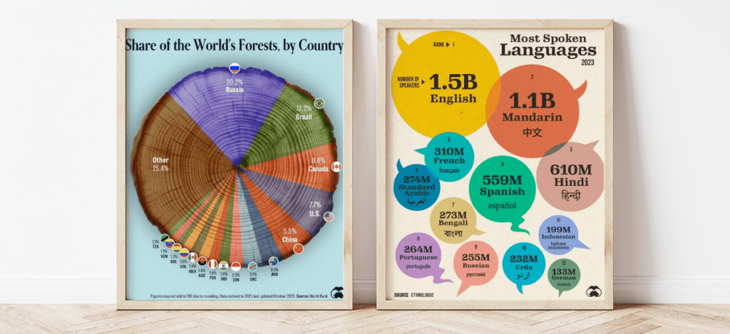
2. Intuitiveness
The most popular data stories spread far and wide, reaching audiences around the world. The most effective graphics don’t require too much explanation or text labels to get their point across.
In the graphics above, there are visual cues that help the viewer understand what’s being shown, even before they’ve read the title or labels. Not every concept lends itself to such a clear visual hook, but when it does, take advantage.
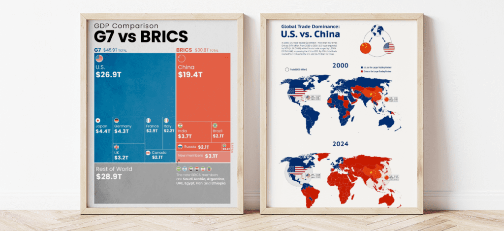
3. Tap into Big Trends
Not every major societal trend is interesting, but some do capture people’s attention and make them feel something (anxiety, excitement, anger, etc). Over the years, the surging popularity of Elon Musk has made people feel all kinds of emotions, from excitement about new technologies to revultion and amusement at his actions and statements. The point is, people feel something about him, which trumps indifference every single time.
In recent years, the struggle for dominance between the U.S. and an ascendant China has been a trend many are watching closely. Both of the graphics above tie directly into this narrative which people have strong feelings and opinions about. Note the bold and strategic use of colour here.
See For Yourself
Want to dig deeper into popular graphics on Voronoi? Check out the Popular feed and switch between timeframes. You never know what patterns you’ll discover.
Or, have a new data story to tell? Submit a visual to Voronoi now.